Comparing the frequentist and Bayesian approaches to statistical inference using OPTIMISE as an example
bayesian
statistics
medicine
r
Author
Nick Plummer
Published
October 8, 2025
This great educational article on the basics of statistical inference came up in resident doctor teaching. I don’t just think it’s great because I work with one of the authors, but because it manages to explain in detail how classical “p-value” medical statistics (or more formally, “frequentist inference”) actually work. And it’s much more difficult to get your head around than you’d think.
The reason we use frequentist statistics in medical research is because they’re computationally relatively simple to perform (so could be done in the days before we carried powerful processors in our pockets), and give us a nice clear binary outcome. It either is or isn’t significant. Easy.
As such, for decades medical research has been dominated by this statistical philosophy which is built on our familiar p-values and confidence intervals. But this is a widely misunderstood, and deeply non-intuitive, approach to medical statistics.
Why is this?
Fundamentally the frequentist question we’re trying to answer is: “Assuming there is no effect of our treatment, how surprising is our data?”. But what we actually want to know (and how we think about clinical problems) is “given our data, what is the probability that this treatment actually works?”
So let’s rethink the core concepts that the article discusses using a Bayesian framework.
A Bayesian take on statistical concepts
The foundational concepts of statistics, such as variables, parameters, and distributions, are tools for understanding data. While Sidebotham and Hewson’s article explains them from a frequentist perspective (focused on the long-run frequency of events) a Bayesian perspective reinterprets them through the lens of updating beliefs based on new data.
Variables and parameters
In the traditional view, a variable is a quantity that changes between individuals in a sample, like age or blood pressure. A parameter, like the true population mean, is an unknown but fixed number that we try to estimate.
Although a Bayesian treats variables the same (this is the data we observe), parameters however are not fixed constants. They are unknown quantities about which we have uncertainty. Therefore, a Bayesian treats a parameter as a random variable and represents our knowledge about it with a probability distribution. Our goal isn’t to estimate a single “true” value but to update our belief distribution about the parameter’s plausible values after seeing the data.
Sampling variability
As the BJAEd article explains, frequentist statistics defines sampling variability as the reason why an estimate (such as of a sample mean) differs between repeated samples from the same population. It is seen as a source of imprecision or error that needs to be quantified.
To a Bayesian this variability is not an error - rather it’s the engine of “learning”. The information contained in our one specific sample (called the likelihood) is what allows us to update our initial beliefs.
The process looks like this:
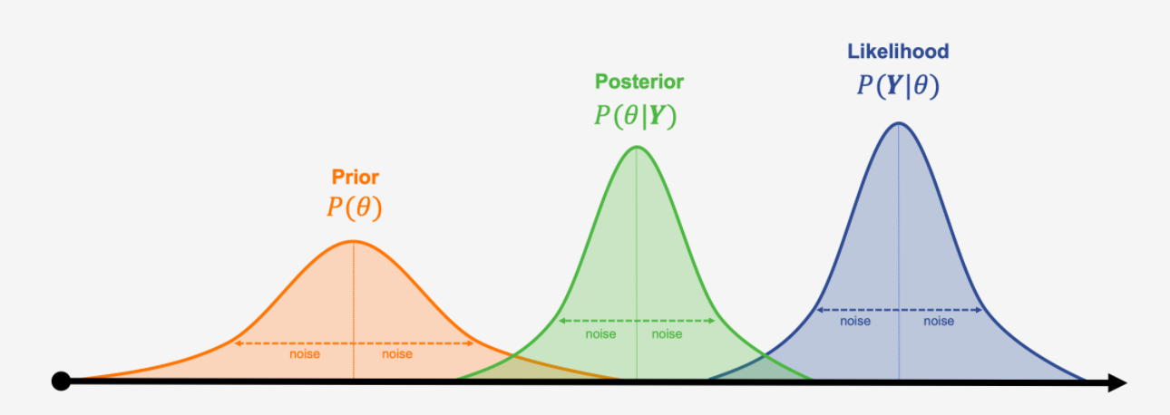
Prior belief: We start with a probability distribution representing our belief about a parameter before seeing the data.
Likelihood (the data): We collect data. The likelihood tells us how probable our observed data is for each possible value of the parameter.
Posterior belief: We combine our prior belief with the data’s likelihood using Bayes’ theorem. The result is a new, updated probability distribution for the parameter, called the posterior.
Updating the prior distribution with the likelihood distribution to get a new posterior distribution, borrowed from Analytics Yogi
So, while a frequentist uses sampling variability to describe the precision of an estimate over many hypothetical trials, a Bayesian uses the information from one sample to directly update their beliefs.
Point estimates and summarising data
Both approaches use the same tools to summarise data, such as the mean, median, and standard deviation.
A frequentist would then use the sample data to calculate a point estimate (a single number, like the observed 6.8% absolute risk reduction in the OPTIMISE trial discussed in the article), that serves as the best guess for the true population parameter.
A Bayesian analysis, however, doesn’t produce just one point estimate. The primary result in a Bayesian analysis is the entire posterior distribution, which shows every plausible value for the parameter and its corresponding probability. While we can summarise this distribution with a single number (like the median or mean) for convenience, the full distribution provides a much richer picture of our uncertainty. The “point estimate” is just one feature of a larger landscape of belief.
Probability distributions and the Central Limit Theorem
In the frequentist framework, probability distributions (like the normal distribution) are used to model how variables are distributed in a population. The Central Limit Theorem is highlighted in the BJAEd article as a cornerstone of this, because it guarantees that the distribution of sample means from many repeated experiments will be approximately normal. This allows frequentists to calculate p-values and confidence intervals, which are statements about long-run procedural performance.
Bayesians use probability distributions more broadly:
To describe our prior belief about a parameter.
To describe the likelihood of the data.
To describe our posterior (updated) belief about the parameter.
The CLT is therefore much less critical in modern Bayesian analysis. Instead of relying on its approximations about hypothetical repeated experiments, Bayesians use computational methods to directly calculate the exact posterior distribution of belief based on the one experiment that was actually conducted. The focus shifts from the frequency of a statistic to the probability of a parameter.
How does this effect “The machinery of statistical inference”?
From a Bayesian perspective, the “machinery of statistical inference” is fundamentally different because it aims to directly estimate the probability of a hypothesis given the data, rather than calculating the probability of the data assuming a hypothesis is true.
Assume no effect: You start by assuming the null hypothesis is true - i.e. that the intervention has no effect in the population.
Calculate a test statistic: You compute a single value from your sample data, which measures how far your result is from the result that you’d expect if the null hypothesis is true.
Consult a hypothetical distribution: You compare this statistic to its null distribution, which is the distribution of results you would get if you repeated the experiment an infinite number of times and the null hypothesis were actually true.
Calculate the p-value: This is the probability of observing data at least as extreme as yours, assuming the null hypothesis is true.
NHST is therefore an indirect, counter-intuitive process. It simply answers the question “how surprising is my data if I assume there is no effect?” without telling you anything about how likely the effect really is.
A Bayesian approach scraps this indirect approach and instead uses Bayes’ Theorem to directly update beliefs in light of new evidence.
This means there is no need for a null hypothesis: Instead of testing against a rigid “no effect” hypothesis, a Bayesian analysis calculates the entire posterior distribution for the effect size. This distribution represents our updated belief about all plausible values for the parameter after seeing the data.
The result of this is a distribution, not a (p-)value. And because the output is not a single value but a full probability distribution, from this we can derive intuitive summaries to describe our new beliefs:
A credible interval: This is a range that contains the true parameter value with a specified probability (e.g. we’re now 95% certain that the true effect lies in this range). This is a direct statement of belief, unlike the confusing definition of a frequentist confidence interval.
Posterior probabilities: We can then directly answer the questions we care about, such as “what is the probability that this treatment provides a clinically meaningful benefit?” or “what is the probability that the effect is greater than zero?”
In essence, the Bayesian approach provides a direct, intuitive, and comprehensive summary of evidence that aligns with how we naturally reason about uncertainty. It moves beyond the rigid and frequently misinterpreted framework of null hypothesis testing to give researchers a more complete picture of what their data is actually telling them.
This is how our brains work when assessing patients! So why don’t we use it for our statistics?
Because the nuances that make Bayesian statistics so intuitive and powerful also make them more computationally complex. Thankfully even cheap NHS laptops are easily powerful enough to perform Bayesian statistics, and although it’s not a simple “point and click t-test” the techniques are relatively easy to learn and apply. So let’s use OPTIMISE as an example, exactly as Sidebotham and Hewson did, but apply a Bayesian approach.
Re-re-analysis of the OPTIMISE trial
The trial compared using cardiac output monitors to guide management of fluids and vasopressors to usual care for patients undergoing major gastrointestinal surgery.
The data:
Intervention group: 134 complications in 366 patients (36.6%).
Control group (usual care): 158 complications in 364 patients (43.4%).
We start by making this machine readable:
library(tidyverse)# Set up the trial dataoptimise_data <-tibble(group =c("Intervention", "Control"),events =c(134, 158),total =c(366, 364))print(optimise_data)
# A tibble: 2 × 3
  group        events total
  <chr>         <dbl> <dbl>
1 Intervention    134   366
2 Control         158   364
The original analysis
The original frequentist analysis reported a p-value of 0.07 and a 95% confidence interval for the relative risk of a complication occuring from 0.71 (less likely) to 1.01 (more likely). Because the confidence interval crosses 1 (no difference) the authors therefore concluded that cardiac output monitors didn’t impact on the rate of complications.
# First turn the tibble data into a matrixoptimise_df <- optimise_data %>%# Calculate the "no event" numbersmutate(`No Event`= total - events) %>%select(group, Event = events, `No Event`) %>%column_to_rownames(var ="group")optimise_matrix <-as.matrix(optimise_df)# Add dimension names (for later maths)dimnames(optimise_matrix) <-list(Group =rownames(optimise_df),Outcome =colnames(optimise_df))# Run Fisher's exact testfisher.test(optimise_matrix)
    Fisher's Exact Test for Count Data

data:  optimise_matrix
p-value = 0.06975
alternative hypothesis: true odds ratio is not equal to 1
95 percent confidence interval:
 0.5533509 1.0246201
sample estimates:
odds ratio
 0.7533585
We find that the odds ratio of a complication to be 0.75 (95% confidence interval 0.55 to 1.02, p = 0.07). The only problem here is that we want a relative risk (more clinically interpretable) rather than the statistically sound but hard to contemplate odds ratio. Thankfully we can do that using epitools instead of doing it by hand:
library(epitools)riskratio(optimise_matrix, rev ="both") # Reverse the data because we want risk of no event
$data
              Outcome
Group          No Event Event Total
  Control           206   158   364
  Intervention      232   134   366
  Total             438   292   730

$measure
              risk ratio with 95% C.I.
Group           estimate     lower    upper
  Control      1.0000000        NA       NA
  Intervention 0.8434668 0.7054437 1.008495

$p.value
              two-sided
Group          midp.exact fisher.exact chi.square
  Control              NA           NA         NA
  Intervention 0.06163689   0.06974791    0.06098

$correction
[1] FALSE

attr(,"method")
[1] "Unconditional MLE & normal approximation (Wald) CI"
This gives us a 0.84 relative risk of a complication (95% confidence interval 0.71 to 1.01, p = 0.0697).
The first re-analysis
Moving on, we can also replicate the two approachs that the Dave’s took in their article. The maths is relatively straightforward. To start with we’ll get the numbers they need:
# Extract data for the Intervention groupint_data <-filter(optimise_data, group =="Intervention")events_int <- int_data$eventstotal_int <- int_data$total# Extract data for the Control groupctrl_data <-filter(optimise_data, group =="Control")events_ctrl <- ctrl_data$eventstotal_ctrl <- ctrl_data$total
Firstly, the risk difference:
# Calculate proportions (risks)p_int <- events_int / total_intp_ctrl <- events_ctrl / total_ctrl# Calculate the risk differencerisk_diff <- p_int - p_ctrl# Calculate the pooled proportion for the standard errorp_pooled <- (events_int + events_ctrl) / (total_int + total_ctrl)se_risk_diff <-sqrt(p_pooled * (1- p_pooled) * (1/total_int +1/total_ctrl))# Calculate the z-statistic and p-valuez_stat_rd <- risk_diff / se_risk_diffp_value_rd <-2*pnorm(abs(z_stat_rd), lower.tail =FALSE)cat("Z-statistic:", round(z_stat_rd, 2), "; p-value:", round(p_value_rd, 4))
Z-statistic: -1.87 ; p-value: 0.061
And secondly, using the log odds ratio:
# Calculate the number of non-eventsno_events_int <- total_int - events_intno_events_ctrl <- total_ctrl - events_ctrl# Calculate the odds ratio and its logarithmodds_ratio <- (events_int * no_events_ctrl) / (no_events_int * events_ctrl)log_or <-log(odds_ratio)# Calculate the standard error of the log ORse_log_or <-sqrt(1/events_int +1/no_events_int +1/events_ctrl +1/no_events_ctrl)# Calculate the z-statistic and p-valuez_stat_or <- log_or / se_log_orp_value_or <-2*pnorm(abs(z_stat_or), lower.tail =FALSE)# Print the resultscat("Z-statistic:", round(z_stat_or, 2), "; p-value:", round(p_value_or, 4))
Z-statistic: -1.87 ; p-value: 0.0612
Again, we get the same answers as they do. So far, so good.
The Bayesian re-re-analysis
To compare this to the Bayesian approach, we can use the powerful brms and tidybayes packages in R.
We’re aiming to model the probability of a complication based on the treatment group. To start with we need a prior, or our belief of the effect before seeing the data. A weakly informative prior is a good start - essentially we believe that there is no effect, but aren’t very sure about it. We’ll use a normal distribution centered on zero, suggesting that very large effects are less likely than small or moderate ones.
# Load the necessary librarieslibrary(brms)library(tidybayes)prior_b <-set_prior("normal(0, 1.5)", class ="b")
Now we can combine our prior belief with the data. This is where the magic happens. Rather than calculating a Z-statistic, this code uses a sampling algorithm called a Markov Chain Monte Carlo (MCMC) simulation. This maps out the shape of a posterior distribution when it is too complex to solve with a simple equation. Because it’s doing it many thousand times, it takes a few seconds to run:
# Run the Bayesian logistic regression model (log-odds of an event occurring)brm_optimise <-brm( events |trials(total) ~1+ group,data = optimise_data,family =binomial(link ="logit"),prior = prior_b,seed =2222# for reproducibility)
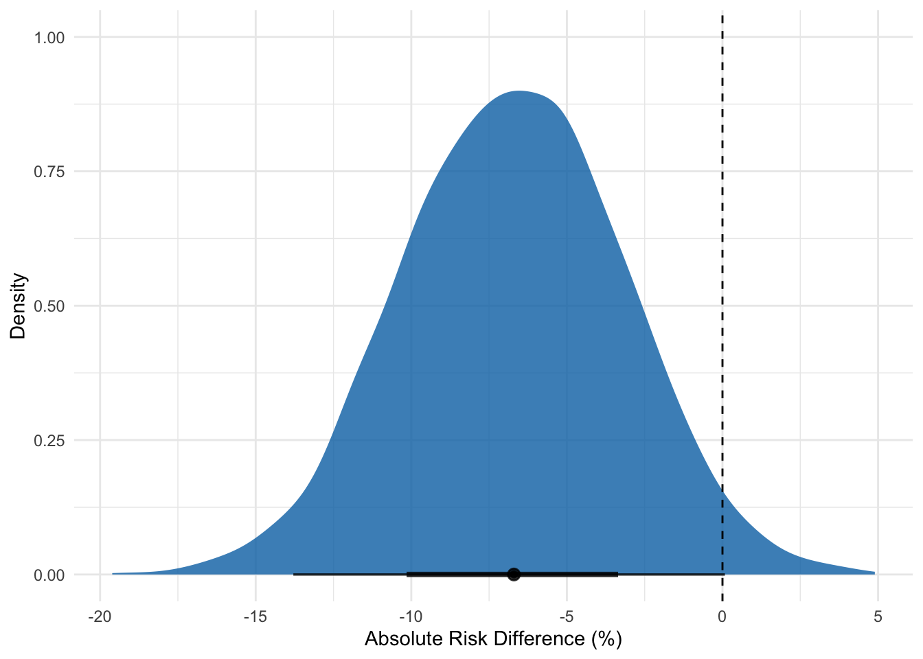
Having done this, we can finally examine the posterior distribution—our updated belief about the treatment’s effect. This graph is the core result of our Bayesian analysis. It shows the full range of plausible values for the treatment’s effect. The peak of the curve represents the most likely values, while the tails represent less likely ones, and the dashed line the point of no effect.
# Extract the posterior draws for interpretationposterior_analysis <- brm_optimise %>%spread_draws(b_Intercept, b_groupIntervention) %>%mutate(# Convert from log-odds back to probabilities and riskprob_control =plogis(b_Intercept),prob_intervention =plogis(b_Intercept + b_groupIntervention),# Calculate key metricsodds_ratio =exp(b_groupIntervention),risk_difference = (prob_intervention - prob_control) *100# as a percentage )# Visualise the result for the risk differenceggplot(posterior_analysis, aes(x = risk_difference)) +stat_halfeye(fill ="#0072B2", alpha =0.8, p_limits =c(0.025, 0.975)) +geom_vline(xintercept =0, linetype ="dashed", color ="black") +labs(x ="Absolute Risk Difference (%)",y ="Density" ) +theme_minimal()
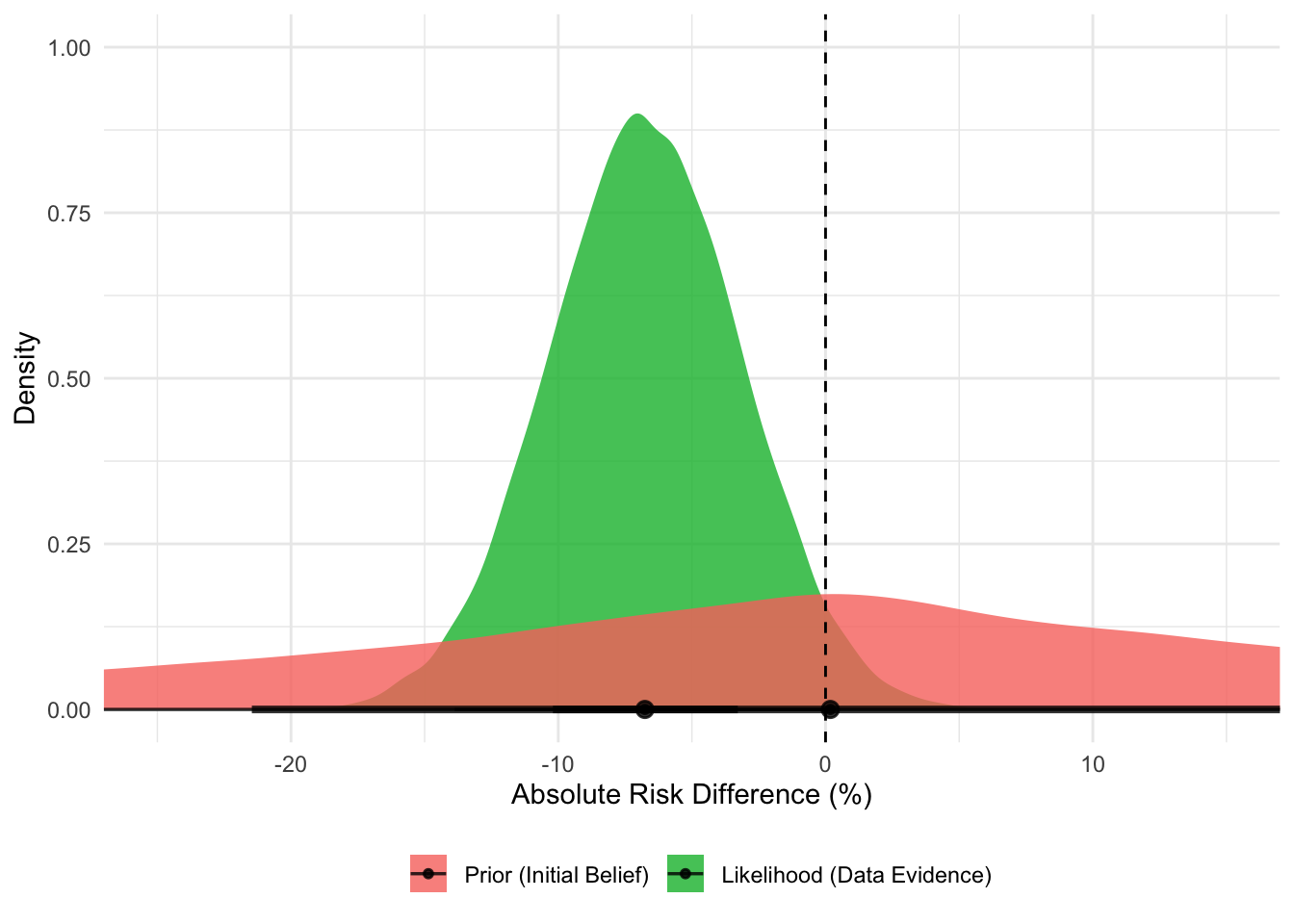
How do we get here? This posterior distribution is the result of combining the prior with the likelihood distribution from the data. It’s the mathematical compromise between our broad initial belief and the specific evidence from the data.
We can visualise this, too:
The Prior (red distribution) is our initial belief. It’s centered on a risk difference of zero (no effect) but is very wide, indicating that we are uncertain and believe a wide range of effects (both beneficial and harmful) are possible before seeing any data.
The Likelihood (green distribution) represents the evidence from the OPTIMISE trial data. It is much narrower and is centered on the observed risk difference of -6.8%. This tells us that the data provides strong evidence pointing towards a moderate benefit.
# Simulate the prior distribution for risk differencen_draws <-40000prior_intercept <-rnorm(n_draws, 0, 1.5)prior_effect <-rnorm(n_draws, 0, 1.5)# For each draw, calculate the implied risk differenceprior_sims <-tibble(prob_control =plogis(prior_intercept),prob_intervention =plogis(prior_intercept + prior_effect),risk_difference = (prob_intervention - prob_control) *100,distribution ="Prior (Initial Belief)")# Simulate the likelihood distribution for risk differencedata_inter <-rbeta(n_draws, 134+1, 366-134+1)data_control <-rbeta(n_draws, 158+1, 364-158+1)likelihood_sims <-tibble(risk_difference = (data_inter - data_control) *100,distribution ="Likelihood (Data Evidence)")# Combine and Plotcombined_plot_data <-bind_rows( prior_sims %>%select(risk_difference, distribution), likelihood_sims) %>%mutate(distribution =factor(distribution, levels =c("Prior (Initial Belief)", "Likelihood (Data Evidence)")) )ggplot(combined_plot_data, aes(x = risk_difference, fill = distribution)) +stat_halfeye(alpha =0.8) +geom_vline(xintercept =0, linetype ="dashed", color ="black") +scale_fill_manual(values =c("Prior (Initial Belief)"="#F8766D", "Likelihood (Data Evidence)"="#00BA38") ) +labs(x ="Absolute Risk Difference (%)",y ="Density",fill ="" ) +coord_cartesian(xlim =c(-25, 15)) +theme_minimal() +theme(legend.position ="bottom")
Comparing the two approaches
Let’s compare the conclusions from the two approaches side-by-side.
The frequentist 95% confidence interval for RR is 0.71 to 1.01. We can interpret this as “if this study were repeated infinitely, 95% of the calculated confidence intervals would contain the one true effect size.” This is a confusing statement about the procedure, not the result itself. Because the interval contains 1.0 (no effect), the result is “not statistically significant.”
The Bayesian 95% credible interval can be calculated from the model:
Our 95% credible interval for the risk difference is -13.8% to +0.1%. The interpretation is simple and far more powerful: “Given the data, there is a 95% probability that the true risk reduction is between 13.8% and a slight risk increase of 0.1%”. But is it “significant”?
Well, we need to rethink the meaning of “significant”. As we said above, the frequentists report that p = 0.07 (or 0.06 if you re-analyse it as per the article). This value is the probability of seeing data this extreme (or more extreme) if the treatment had no effect. Since 0.07 > 0.05, the result is deemed “not statistically significant.” This binary thinking creates a “cliff edge” where p = 0.049 is a success and p = 0.051 is a failure, even when the evidence is virtually identical.
The Bayesian approach is to instead estimate the probability of benefit. We can ask a more practical question: “What’s the probability that the treatment is beneficial (i.e. that the risk difference is less than zero)?” using the model:
Again, this value (our updated belief following the new evidence) is a far more powerful answer. The Bayesian interpretation is: “There is a 97.4% probability that cardiac output-guided management is better than usual care.”
The Bayesian analysis, however, provides a much clearer picture. While a very small harm isn’t entirely ruled out (the credible interval crosses zero), the evidence strongly points towards a benefit (with a 97.4% probability). Yes, the computation approach is slightly more difficult, but using it allows for a more nuanced discussion about whether a 6.7% risk reduction with a high probability of being real is clinically meaningful, moving us beyond the simplistic, and often misleading, tyranny of “statistical significance”.