mmp_zp %>% ggplot() +
  aes(x = duration_s, y = power_w) +
  geom_line() +
  scale_x_continuous(trans='log10') +
  xlab("Duration (s)") +
  ylab("Power (W)") +
  theme_bw() +
theme(legend.position = "none") 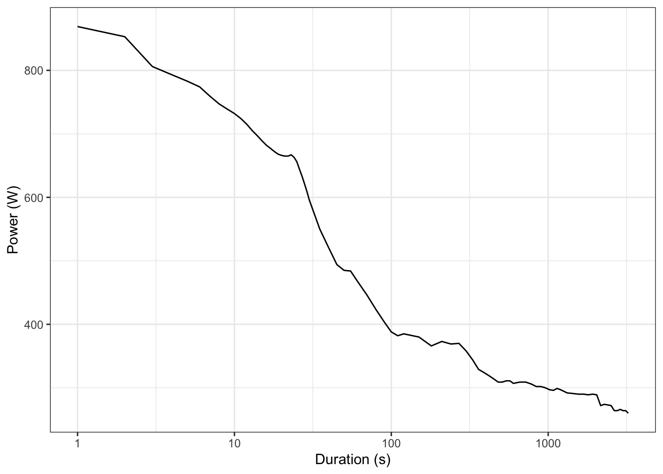
It’s ZRL season again, and for this season they’re subdividing divisions into standard and “development” teams.
For a while now Zwift’s categories are based on two automatically updating calculations - your “zFTP” (or Zwift estimation of FTP) and “zMAP” (Zwift estimation of maximal aerobic power, or the power you deliver at VO₂max). These have become even more relevant this year as the exact values of the two of these determine whether you can enter a development (“easier”) or a standard league.
Both FTP and MAP are traditionally assessed using formal tests (e.g. a 20-minute interval or ramp test for FTP, or 5-minute effort or on a CPET for MAP). However to avoid making people take mandatory tests, while also ensuring that people are put into relatively fair categories for racing, Zwift instead uses these rolling performance estimates. But how do they work?
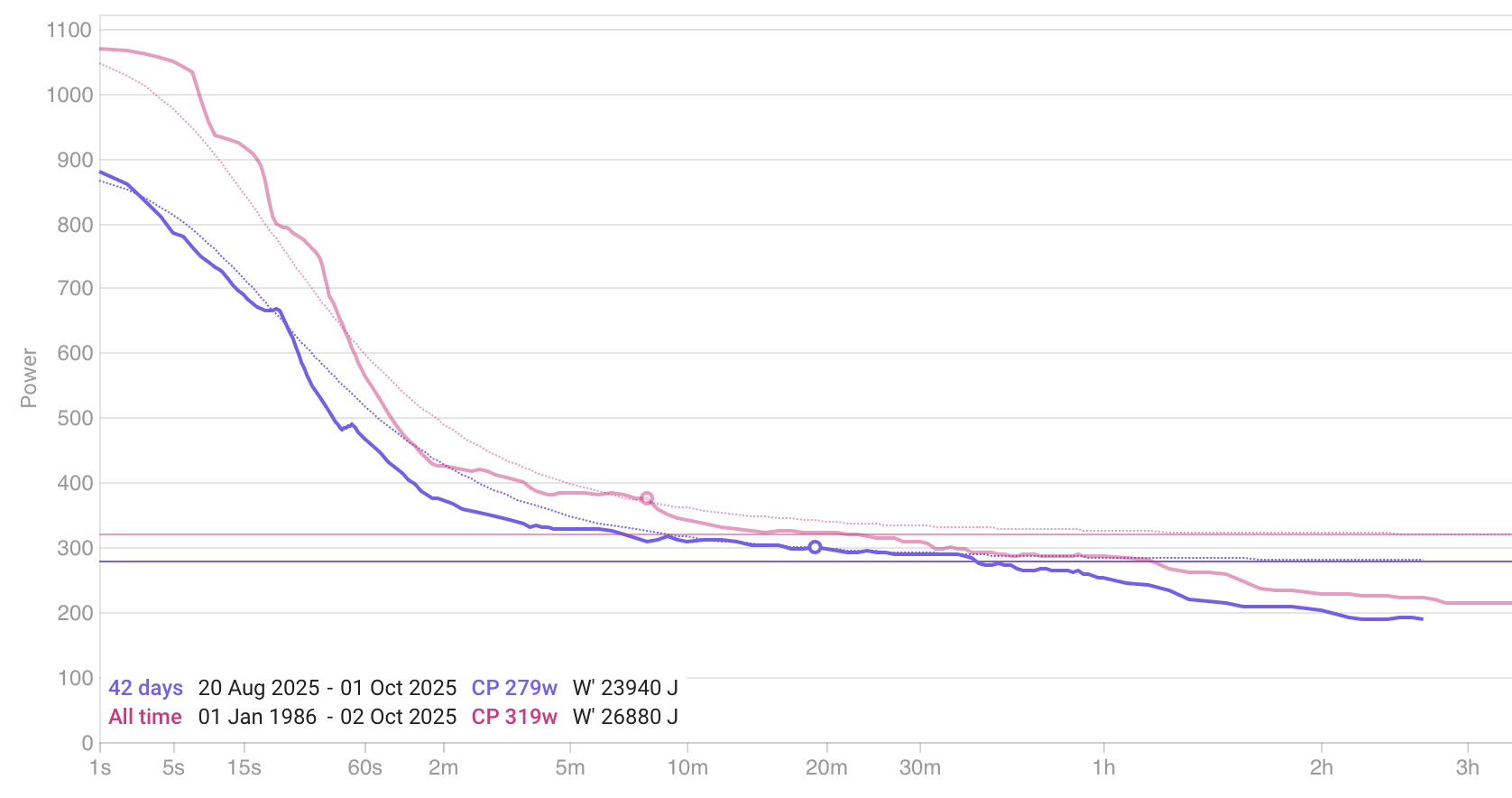
Both are based on your 90 day mean-maximal power (MMP) curve, which represents the maximum amount of power you’ve put out for different durations over the last 90 days (and assuming therefore that these are your maximal efforts). You can see your own curve from events on ZwiftPower or on your Zwift profile, although note that Zwift also includes workouts and free rides, so it’s data will be slightly different to what you see on ZP.
Let’s get my power curve from ZP by querying their API:
mmp_zp %>% ggplot() +
aes(x = duration_s, y = power_w) +
geom_line() +
scale_x_continuous(trans='log10') +
xlab("Duration (s)") +
ylab("Power (W)") +
theme_bw() +
theme(legend.position = "none")
Apparently I haven’t done an event longer than 54 minutes in the last 90 days, which slightly limits our ability to do these calculations. It’s a bit trickier to manipulate their API, but thankfully through the magic of “Show Page Source” we can also see what Zwift thinks by copying and pasting:
library(tidyjson)
library(lubridate)
library(stringr)

tj <- as.tbl_json(readr::read_file("zwift_curve.json"))

mmp <- tj %>%
  enter_object("cpBestEfforts") %>%
  enter_object("pointsWatts") %>%
  gather_keys("duration_s") %>%
  enter_object() %>%
  spread_values(
    power_w = jnumber("value"),
  ) %>%
  mutate(
    duration_s = as.numeric(duration_s),
  ) %>%
  select(duration_s, power_w) %>%
  arrange(duration_s)
mmp %>%
ggplot() +
aes(x = duration_s, y = power_w) +
geom_line() +
scale_x_continuous(trans='log10') +
xlab("Duration (s)") +
ylab("Power (W)") +
theme_bw() +
theme(legend.position = "none") 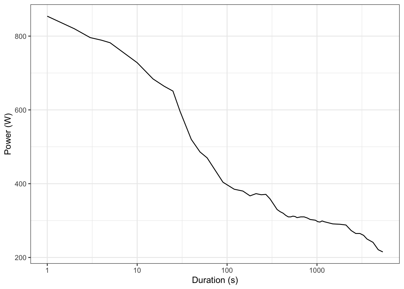
That looks more promising. Now lets see how these estimates work.
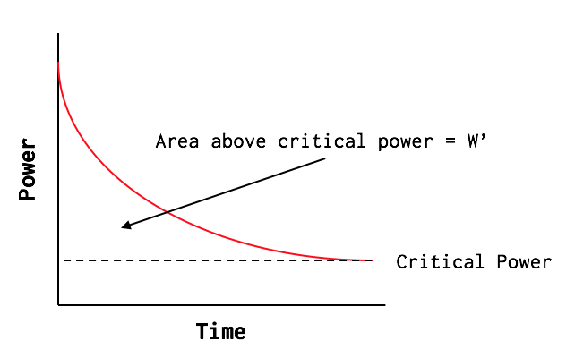
FTP is - without getting too bogged down in an argument - an estimate of your one-hour sustainable power. How exactly you measure FTP is the subject of much debate, and what Zwift is doing here is more accurately described as estimating your critical power. But cyclists know FTP, hence the name.
It does this by fitting the two-parameter CP model. Zwift claims that they use your 8 to 50 minute efforts for this, and put these into a nonlinear regression between work and duration:
\[P = CP + \frac{W’}{t}\]
Where:
It should look something like this graph borrowed from HighNorth, with CP the point where the curve flattens out (theoretically therefore the power you can sustain “for ever”) and W’ the area under the curve above CP (because power is measured in W i.e. J/s, so multiply by time in seconds to get J):
Let’s try it:
fit_cp_2param <- function(mmp_tbl, use_range = c(8*60, 50*60)) {

  # Input: tibble with duration_s and power_w
  stopifnot(all(c("duration_s","power_w") %in% names(mmp_tbl)))

  dat <- mmp_tbl %>%
    filter(between(duration_s, use_range[1], use_range[2])) %>%
    mutate(work_j = power_w * duration_s) %>%
    drop_na()
  if (nrow(dat) < 3) stop("Not enough points in the selected duration range to fit CP.")

  # Linear model: work_j ~ duration_s  => slope = CP, intercept = W'
  mod <- lm(work_j ~ duration_s, data = dat)

  CP     <- as.numeric(coef(mod)["duration_s"])   # Watts
  Wprime <- as.numeric(coef(mod)["(Intercept)"])  # Joules

  # Build fitted curve across whole (cleaned) domain
  grid <- mmp_tbl %>%
    arrange(duration_s) %>%
    transmute(duration_s,
              power_model_w = CP + Wprime / duration_s)

  # Returns list(CP, Wprime, model, fitted_curve)
  list(
    CP = CP,
    Wprime = Wprime,
    model = mod,
    fitted_curve = grid
  )
}

( fit <- fit_cp_2param(mmp) )
$CP
[1] 258.7709
$Wprime
[1] 36676.79
$model
Call:
lm(formula = work_j ~ duration_s, data = dat)
Coefficients:
(Intercept) duration_s
36676.8 258.8
$fitted_curve
# A tbl_json: 52 x 3 tibble with a "JSON" attribute
..JSON duration_s power_model_w
<chr> <dbl> <dbl>
1 "{\"value\":854,\"d..." 1 36936.
2 "{\"value\":820,\"d..." 2 18597.
3 "{\"value\":796,\"d..." 3 12484.
4 "{\"value\":789,\"d..." 4 9428.
5 "{\"value\":782,\"d..." 5 7594.
6 "{\"value\":728,\"d..." 10 3926.
7 "{\"value\":684,\"d..." 15 2704.
8 "{\"value\":664,\"d..." 20 2093.
9 "{\"value\":651,\"d..." 25 1726.
10 "{\"value\":596,\"d..." 30 1481.
# ℹ 42 more rowsWe can visualise it too:
mmp %>% ggplot() +
  aes(x = duration_s, y = power_w) +
  geom_line() +
  scale_x_continuous(trans='log10') +
  geom_hline(yintercept = fit$CP, linetype = "dashed") +
  xlab("Duration (s)") +
  ylab("Power (W)") +
  theme_bw() +
theme(legend.position = "none") 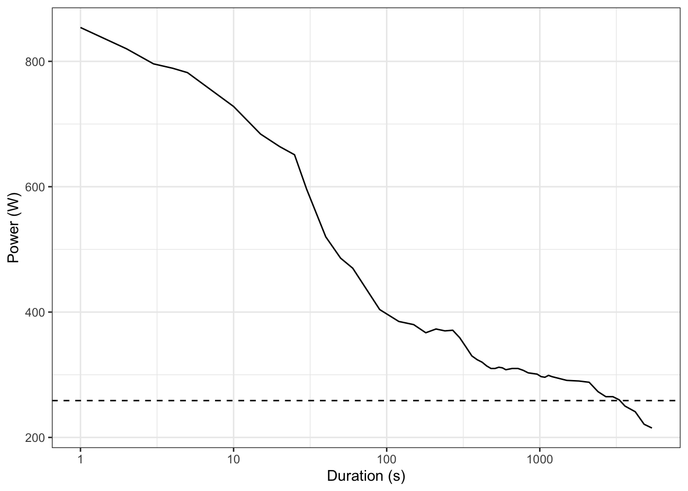
So based on this curve my CP should be 259W… but Zwift thinks it’s 280W. Let’s go back to the data from my Zwift profile. Interestingly there’s also a table of “Revelant Efforts”, and these range from 5 seconds to 40 minutes:
relevant <- tj %>%
  enter_object("relevantCpEfforts") %>%
  gather_array() %>%
  spread_values(
    power_w    = jnumber("watts"),
    dur_s      = jnumber("duration"),
    label      = jstring("cpLabel")
  ) %>%
  mutate(
    duration_s = as.integer(dur_s)
  ) %>%
  select(duration_s, power_w, label) %>%
  arrange(duration_s)

print(relevant)
# A tbl_json: 12 x 4 tibble with a "JSON" attribute
..JSON duration_s power_w label
<chr> <int> <dbl> <chr>
1 "{\"watts\":782,\"w..." 5 782 5 sec
2 "{\"watts\":684,\"w..." 15 684 15 sec
3 "{\"watts\":596,\"w..." 30 596 30 sec
4 "{\"watts\":470,\"w..." 60 470 1 min
5 "{\"watts\":367,\"w..." 180 367 3 min
6 "{\"watts\":359,\"w..." 300 359 5 min
7 "{\"watts\":308,\"w..." 600 308 10 min
8 "{\"watts\":310,\"w..." 720 310 12 min
9 "{\"watts\":302,\"w..." 900 302 15 min
10 "{\"watts\":297,\"w..." 1200 297 20 min
11 "{\"watts\":290,\"w..." 1800 290 30 min
12 "{\"watts\":273,\"w..." 2400 273 40 minSo let’s try the model again, using only these values:
fit_2 <- fit_cp_2param(relevant, use_range = c(5, 40*60))So using their limits Zwift thinks my CP is 275W, which is much closer to the 280W listed on my Zwift profile, or 279W as estimated by Intervals.icu which strips all my data for everything from my Garmin (and uses a slightly different CP model):
Finally, lets try using the ZwiftPower data, but only within the time limits that Zwift actually uses for their calculation.
fit_3 <- fit_cp_2param(mmp_zp, use_range = c(5, 40*60))This estimates my CP as 279W - almost spot on!
Moving onto zMAP - this is an estimate of your power at VO₂max, which is roughly equivalent to your 5-minute maximal power.
They claim to do this by looking for your best 4–6 minute efforts, with the resulting average over that window your zMAP. So it’s not literally “your best 5-minute power” but a derived value that approximates your aerobic ceiling, that is, the power at which you reach VO₂max.
In effect, there’s two potential ways Zwift can compute it, and they haven’t been clear about which one they use:
Let’s do try them both:
zmap_from_curve <- function(mmp_tbl,
                            fitted_curve,
                            method = c("model","empirical"),
                            window = c(4*60, 6*60)) {

  method <- match.arg(method)

  if (method == "model") {
    z <- fitted_curve %>% filter(between(duration_s, window[1], window[2]))
    if (!nrow(z)) stop("No modeled points in the specified zMAP window.")
    return(mean(z$power_model_w, na.rm = TRUE))
  } else {
    z <- mmp_tbl %>% filter(between(duration_s, window[1], window[2]))
    if (!nrow(z)) stop("No empirical MMP points in the specified zMAP window.")
    return(mean(z$power_w, na.rm = TRUE))
  }
}

zMAP_model <- zmap_from_curve(mmp_zp, fit_3$fitted_curve, method = "model")
zMAP_emp   <- zmap_from_curve(mmp_zp, fit_3$fitted_curve %>% mutate(power_model_w = NA_real_),
                              method = "empirical")
This gives us a modelled MAP of 320W, or an empirical MAP of 354W, which is much closer to the MAP listed in my Zwift profile of 359W.
We can visualise the two approaches:
plot_df <- mmp_zp %>%
  left_join(fit_3$fitted_curve, by = "duration_s") %>%
  select(c("duration_s", "power_w", "power_model_w"))

ggplot(plot_df %>% filter(duration_s >= 4*60 & duration_s <= 6*60), aes(x = duration_s)) +
  geom_line(aes(y = power_model_w), linetype = 2, colour = "blue", linewidth = 1.2) +
  geom_point(aes(y = power_w), colour = "darkred", size = 2) +
  geom_hline(yintercept = zMAP_emp, colour = "darkred", linewidth = 0.8) +
  geom_hline(yintercept = zMAP_model, colour = "blue", linewidth = 0.8) +
  scale_x_continuous("Duration (s)",
                     breaks = seq(4*60, 6*60, by = 30)) +
  ylab("Power (W)") +
  theme_bw()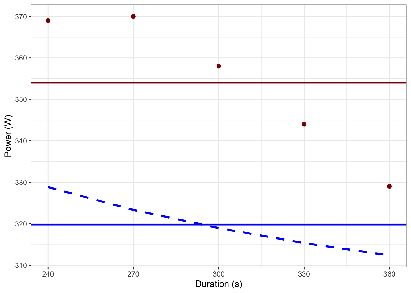
The reason for the difference is clear - the modelled power in the 4-6 minutes range (blue) is much lower than my actual best efforts (red), meaning the mean (horizontal line) is also lower. This is due to limitations in the 2-parameter CP model being used, as it’s computationally simple (and fairly reliable for CP) but the model lacks accuracy at extremely short or long durations. This also probably explains why Zwift appears to be using the empirical model to approximate MAP, rather than a more complex CP model.
Lets try once more, using the Zwift “relevant” data:
zMAP_z_mod <- zmap_from_curve(mmp, fit_2$fitted_curve, method = "model")
zMAP_z_emp   <- zmap_from_curve(mmp, fit_2$fitted_curve %>% mutate(power_model_w = NA_real_),
                              method = "empirical")
Again, the empirical model seems to be closer to what they’re using at 355W, rather than the modelled value 327W.
Given we’ve gor the numbers, this is moderately interesting. For most vaguely “trained” athletes (i.e. the majority of people racing on Zwift), the ratio zFTP/zMAP ≈ 0.75–0.85. Indeed, the value depends on endurance conditioning, and can help phenotype rider types:
Mine works out as 0.79, which is a little disappointing as an alleged triathlete, and also removes my “I’ve got no punch because I’m a triathlete” excuse for not winning races. Dammit.