I recently came across the amazing “Git Sweaty” dashboard, which reimagines your Strava data in a similar way to Github repo contributions. Mine shows an interesting (to me, almost certainly to nobody else) increase in intensity over the years, a slow ramping up of strength work and swimming, and in particular how often I ride at either 5am (before work) or 7pm (after work), as well as highlighting Zwift racing on Tuesday evenings and TTT on Thursdays.
However, this visualisation got me wondering - does Garmin see it similarly? In particular, does Garmin’s “Training Status” match up with the amount of work I’m ostensibly doing?
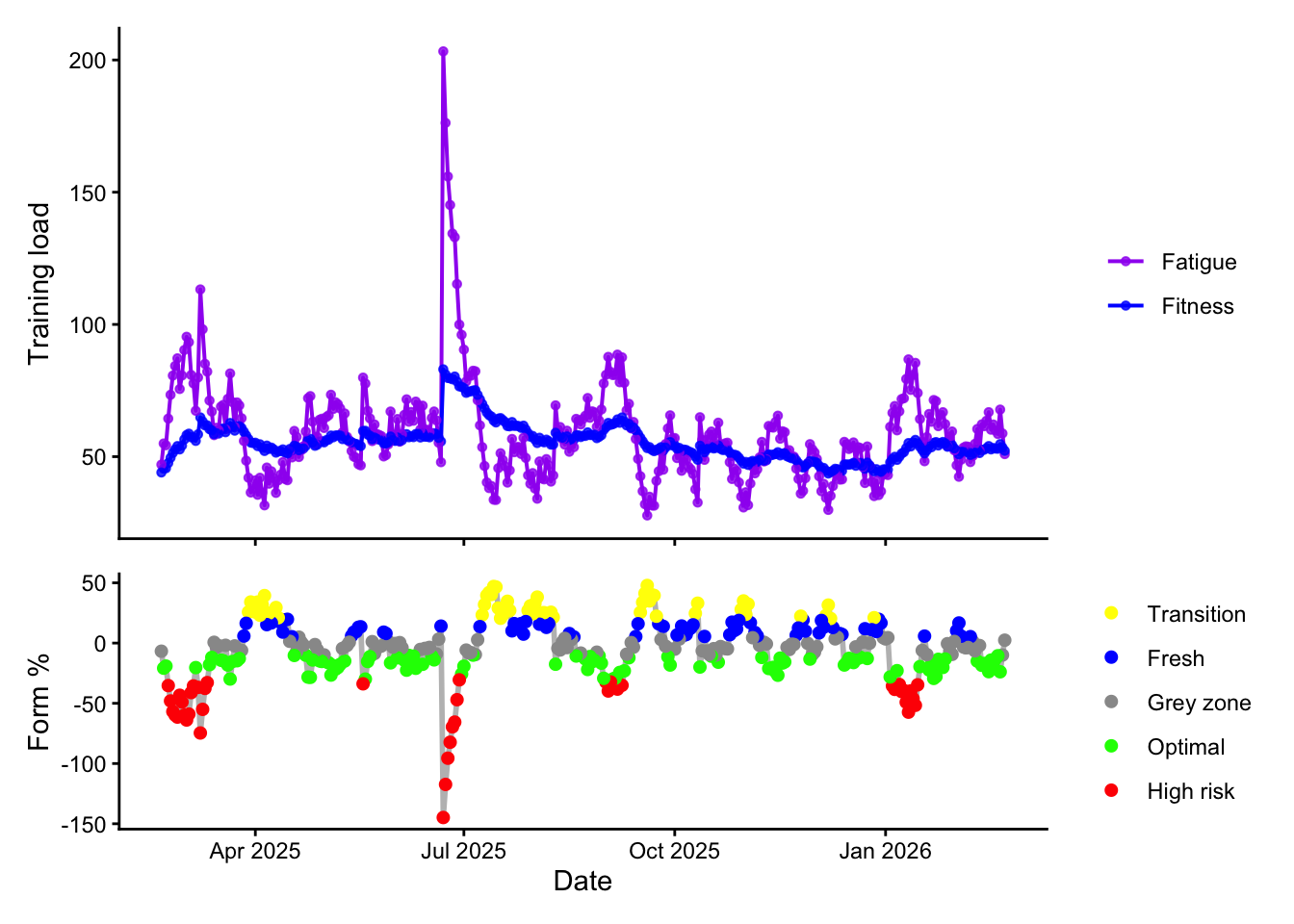
Intervals plots acute load as “fatigue” (a 7 day exponentially weighted moving average), and chronic load as “fitness” (a 42 day EWMA). From this it derives “Form” or training stress balance, which is chronic - acute load, normalised by chronic load.
For me, it looked like this. You can see a couple of big events causing huge spikes in acute fatigue, and also how illness, house redevelopment, etc had an impact on my overall consistency through the year:
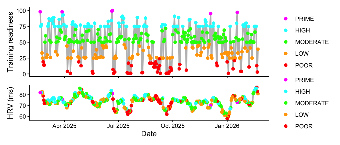
Finally, Garmin estimates training status based on acute load, HRV, VO2max estimations, and any heat or altitude acclimatisation. We can plot this against load (which is most clear from Intervals):
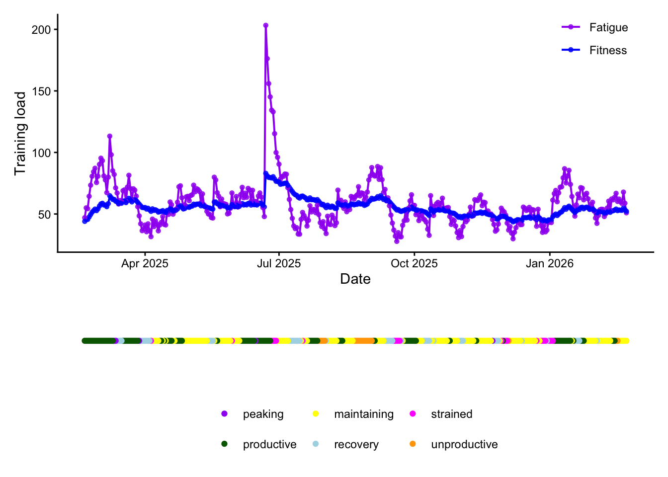
And this kind of makes sense. Periods with a lot of sustained work (for example early in both years during FRR and TdZ, in the run up to Dragon Ride in the middle of the year, and Hyrox Birmingham in October) are associated with productive status, while periods of sudden spikes in acute load are associated with a “strained” status (“Your performance ability is currently limited with inadequate recovery”, according to Garmin). I’m also surprised at how infrequently Garmin had me down as unproductive!
But can we do better than that in predicting what our Garmin will think?
Show code
d <- data %>%select(Date, Status, ctl, atl) %>%filter(!is.na(Status), !is.na(ctl), !is.na(atl)) %>%mutate(Status =factor(Status),ctl_z =as.numeric(scale(ctl)),atl_z =as.numeric(scale(atl)) )m0 <-multinom(Status ~1, data = d, trace =FALSE)m1 <-multinom(Status ~ ctl_z + atl_z, data = d, trace =FALSE)anova(m0, m1, test ="Chisq")
          Model Resid. df Resid. Dev   Test    Df LR stat. Pr(Chi)
1             1      1840  1037.3530           NA       NA      NA
2 ctl_z + atl_z      1830   923.3229 1 vs 2    10 114.0301       0
This simple model suggests that training status is strongly related to Interval’s calculated chronic and acute load (compared to m0, a model of no relationship). Sure, daily data is to some degree autocorrelated, but the likelihood-ratio for an association is high even for this.
This is quite interesting, and mostly fits what Garmin says publicly:
Productive: Holding CTL constant, while raising ATL strongly increases the odds of “productive” vs “maintaining”; holding holding ATL constant, higher CTL decreases the odds of “productive” vs “maintaining”.
Recovery: Higher CTL and much lower ATL is strongly more likely “recovery” vs “maintaining”. That’s intuitive: you’re relatively fit, but acute load is very low.
However it’s not entirely clear:
Peaking: Both ATL and CTL are mildly positive, but not clearly different from zero. This probably means there’s something else in the model that means you’ve worked hard before, and now you’re leveling off.
Strained: These changes are tiny. This means strained isn’t particular well-explained by CTL/ATL in this linear model, suggesting it probably depends on other variables like sleep or HRV.
We can explain these to some degree by looking at how often they come up:
Peaking and strained are so rare that the model is being dominated by productive and maintaining days. However, the clearest signal from this is high ATL is “productive”, and low ATL leads to “recovery”, with CTL tweaking those odds. What happens if we add some non-linear terms?
                                                  Model Resid. df Resid. Dev
1                                         ctl_z + atl_z      1830   923.3229
2 ctl_z + atl_z + I(ctl_z^2) + I(atl_z^2) + ctl_z:atl_z      1815   813.7269
    Test    Df LR stat.      Pr(Chi)
1           NA       NA           NA
2 1 vs 2    15  109.596 2.220446e-16
Adding the nonlinear terms dramatically improves how well CTL/ATL explain Garmin Status, with a ~80 point improvement in AIC. That matches reality - the labels are usually about combinations of fitness and fatigue and thresholds, rather than straight lines.
But can we predict our training status? As this is a time-series using train/test splits will overstate performance because days next to each other will look similar. Instead we can use a walk-forward evaluation, using glmnet due to the imbalanced classes:
Show code
# Helper functionsmulticlass_logloss <-function(y_true, p_mat) { eps <-1e-15 p <-pmin(pmax(p_mat, eps), 1- eps) idx <-cbind(seq_along(y_true), match(y_true, colnames(p)))-mean(log(p[idx]))}pad_probs <-function(p, lev) {# p: matrix (n x k) with some subset of columns# lev: full set of levels missing <-setdiff(lev, colnames(p))if (length(missing) >0) { pad <-matrix(0, nrow =nrow(p), ncol =length(missing),dimnames =list(NULL, missing)) p <-cbind(p, pad) } p[, lev, drop =FALSE]}# Walk-forward evaluatoreval_glmnet_walkforward <-function(df, features =c("linear","nonlinear"),k0 =120, step =14,alpha =0.5, nfolds_target =10,lambda_fallback =0.01) { features <-match.arg(features) df <- df %>%arrange(Date) %>%mutate(Status =factor(Status)) lev <-levels(df$Status)if (features =="linear") { X <-model.matrix(~ ctl_z + atl_z, df)[, -1, drop =FALSE] } else { X <-model.matrix(~ ctl_z + atl_z +I(ctl_z^2) +I(atl_z^2) + ctl_z:atl_z, df)[, -1, drop =FALSE] } y_all <- df$Status acc <-c(); ll <-c()for (i inseq(k0, nrow(df) -1, by = step)) { idx_train <-1:i idx_test <- (i +1):min(i + step, nrow(df)) y_train <-droplevels(y_all[idx_train]) X_train <- X[idx_train, , drop =FALSE] y_test <- y_all[idx_test] X_test <- X[idx_test, , drop =FALSE]# choose a safe nfolds n_train <-length(y_train) nfolds <-min(nfolds_target, max(3, floor(n_train /25))) # >=3 always# try CV, else fallback lambda lambda_use <- lambda_fallback cv_ok <-TRUEset.seed(1) cv_fit <-try(cv.glmnet(x = X_train, y = y_train,family ="multinomial",type.multinomial ="grouped",alpha = alpha,nfolds = nfolds,standardize =TRUE ),silent =TRUE )if (!inherits(cv_fit, "try-error")) { lambda_use <- cv_fit$lambda.1se } else { cv_ok <-FALSE } fit <-glmnet(x = X_train, y = y_train,family ="multinomial",type.multinomial ="grouped",alpha = alpha,lambda = lambda_use,standardize =TRUE ) p_arr <-predict(fit, newx = X_test, type ="response") p <-as.matrix(p_arr[, , 1, drop =TRUE])colnames(p) <-dimnames(p_arr)[[2]] p <-pad_probs(p, lev) pred <- lev[max.col(p, ties.method ="first")] acc <-c(acc, mean(pred == y_test)) ll <-c(ll, multiclass_logloss(y_test, p)) }list(mean_acc =mean(acc), mean_logloss =mean(ll), acc = acc, logloss = ll, levels = lev)}# Linearres_lin <-eval_glmnet_walkforward(d, features ="linear",k0 =120, step =14, alpha =0.5)# Nonlinear (quadratic + interaction)res_nl <-eval_glmnet_walkforward(d, features ="nonlinear", k0 =120, step =14, alpha =0.5)
Our simple linear model has an accuracy of 0.399. This is worse than if it just guessed “maintaining” (0.420). The non-linear model is slightly better, with an accuracy of 0.418, but log loss is markedly worse (2.564 vs 2.564), meaning that the nonlinear model is making more overconfident wrong predictions (or poorly calibrated probabilities), even if its top class is slightly more often correct.
What can we take away from this? CTL/ATL are associated with training status (see the LR tests), but alone are not sufficient to predict training status better than a naive baseline. This isn’t particularly surprising. Garmin uses other signals (VO2max trend, load focus, HRV/sleep/recovery, etc), and additionally labels like “unproductive” are often driven by performance trend rather than pure load.
We’ll have one last try. As plotted above, we have HRV data. We can also try and add some awareness of changes over time, and with only 5 peaking days, it will wreck probability calibration so we’ll just call it productive for now:
Show code
# Add time-derived featuresd_feat <- data %>%arrange(Date) %>%# Normalise HRV/CTL/ATLmutate(hrv_z =as.numeric(scale(HRV)),ctl_z =as.numeric(scale(ctl)),atl_z =as.numeric(scale(atl)),# Ratio / formacwr = atl /pmax(ctl, 1e-6),# Rolling HRV featureshrv_7d =slide_dbl(HRV, mean, .before =6, .complete =TRUE),dhrv_7 = HRV - hrv_7d,# Load trend features (chronic 2w, acute 1w)dctl_14 = ctl -lag(ctl, 14),datl_7 = atl -lag(atl, 7) ) %>%filter(!is.na(hrv_7d), !is.na(dctl_14), !is.na(datl_7)) %>%mutate(Status =fct_collapse(Status,productive ="peaking")) %>%mutate(Status =factor(Status))eval_glmnet_walkforward2 <-function(df, k0 =120, step =14, alpha =0.5, lambda_fallback =0.01) { df <- df %>%arrange(Date) %>%mutate(Status =factor(Status)) lev <-levels(df$Status) X <-model.matrix(~ ctl_z + atl_z + acwr + hrv_z + dhrv_7 + dctl_14 + datl_7, df )[,-1, drop =FALSE] y_all <- df$Status multiclass_logloss <-function(y_true, p_mat) { eps <-1e-15 p <-pmin(pmax(p_mat, eps), 1- eps) idx <-cbind(seq_along(y_true), match(y_true, colnames(p)))-mean(log(p[idx])) } pad_probs <-function(p, lev) { missing <-setdiff(lev, colnames(p))if (length(missing) >0) { pad <-matrix(0, nrow =nrow(p), ncol =length(missing), dimnames =list(NULL, missing)) p <-cbind(p, pad) } p[, lev, drop =FALSE] } acc <-c(); ll <-c()for (i inseq(k0, nrow(df) -1, by = step)) { idx_train <-1:i idx_test <- (i +1):min(i + step, nrow(df)) y_train <-droplevels(y_all[idx_train]) X_train <- X[idx_train, , drop =FALSE] y_test <- y_all[idx_test] X_test <- X[idx_test, , drop =FALSE]# CV can still be fragile with rare classes; keep it simple + safe nfolds <-5set.seed(1) cv_fit <-try(cv.glmnet(X_train, y_train, family="multinomial", type.multinomial="grouped",alpha=alpha, nfolds=nfolds, standardize=TRUE),silent =TRUE ) lambda_use <-if (!inherits(cv_fit, "try-error")) cv_fit$lambda.1se else lambda_fallback fit <-glmnet(X_train, y_train, family="multinomial", type.multinomial="grouped",alpha=alpha, lambda=lambda_use, standardize=TRUE) p_arr <-predict(fit, newx = X_test, type ="response") p <-as.matrix(p_arr[,,1, drop =TRUE])colnames(p) <-dimnames(p_arr)[[2]] p <-pad_probs(p, lev) pred <- lev[max.col(p, ties.method ="first")] acc <-c(acc, mean(pred == y_test)) ll <-c(ll, multiclass_logloss(y_test, p)) }list(mean_acc =mean(acc), mean_logloss =mean(ll))}res_hrv <-eval_glmnet_walkforward2(d_feat, k0=120, step=14, alpha=0.5)
This is much better - accuracy has improved to 0.54 and log loss fallen to 1.615. This means that training status is not simply just a load classifier, but is strongly influenced by recovery physiology and recent trends.
We can compare this to just guessing the most common status in the last 120 days:
What can we take away from this? The model is mainly distinguishing maintaining vs productive (including peaking), and it does some Recovery/Strained separation. However, it never predicts unproductive! As much as I’d like to say it’s because I’m never unproductive, it’s probably more to do with this being an imbalanced multi-class problem.
Productive was by far the strongest class separation we’ve got. 34 “maintaining” days were misclassified as “productive bucket”, meaning that CTL/ATL/HRV features don’t capture Garmin’s “maintaining” logic well, and recovery often looks like maintaining in our model (likely because HRV/HRV-suppression isn’t always distinct enough, or load is moderate rather than clearly low). Strained was misclassified maintaining/recovery around 50% of the time.
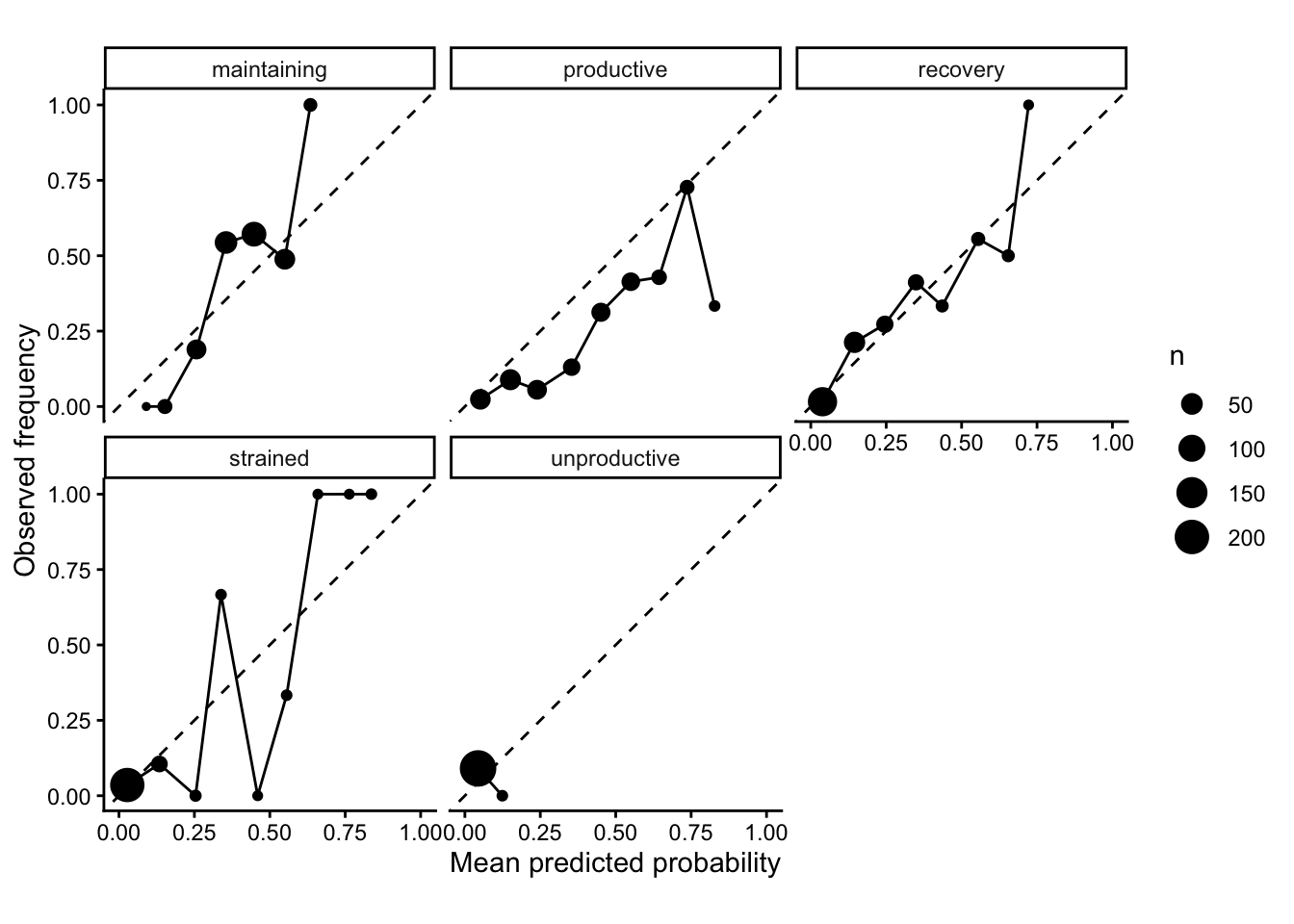
Let’s look at how well these classes are calibrated. The x-axis shows the model’s mean predicted probability for a set of days, and the y-axis the how often that actually happened, with the dashed diagonal line a perfect predictor:
Show code
get_preds_df_glmnet <-function(df,formula =~ ctl_z + atl_z + acwr + hrv_z + dhrv_7 + dctl_14 + datl_7,k0 =120, step =14,alpha =0.5,nfolds =5,lambda_fallback =0.01) { df <- df %>%arrange(Date) %>%mutate(Status =factor(Status))# Global class levels (fixed across folds) lev <-levels(df$Status)# Build model matrix once X <-model.matrix(formula, df)[, -1, drop =FALSE] y_all <- df$Status all_rows <-list()# Helper: pad missing classes pad_probs <-function(p, lev) { missing <-setdiff(lev, colnames(p))if (length(missing) >0) { pad <-matrix(0, nrow =nrow(p), ncol =length(missing),dimnames =list(NULL, missing)) p <-cbind(p, pad) } p[, lev, drop =FALSE] }for (i inseq(k0, nrow(df) -1, by = step)) { idx_train <-1:i idx_test <- (i +1):min(i + step, nrow(df)) X_train <- X[idx_train, , drop =FALSE] y_train <-droplevels(y_all[idx_train]) X_test <- X[idx_test, , drop =FALSE] y_test <- y_all[idx_test]# CV (may fail early with rare classes) -> fallback lambdaset.seed(1) cv_fit <-try(cv.glmnet(x = X_train, y = y_train,family ="multinomial",type.multinomial ="grouped",alpha = alpha,nfolds = nfolds,standardize =TRUE ),silent =TRUE ) lambda_use <-if (!inherits(cv_fit, "try-error")) cv_fit$lambda.1se else lambda_fallback fit <-glmnet(x = X_train, y = y_train,family ="multinomial",type.multinomial ="grouped",alpha = alpha,lambda = lambda_use,standardize =TRUE )# Predict probabilities -> array [n, classes, 1] p_arr <-predict(fit, newx = X_test, type ="response") p <-as.matrix(p_arr[, , 1, drop =TRUE])colnames(p) <-dimnames(p_arr)[[2]]# Pad + reorder to global levels p <-pad_probs(p, lev)# Build fold df fold_df <-tibble(Date = df$Date[idx_test],truth = y_test )# Add prob columns named p_<class>for (cls in lev) { fold_df[[paste0("p_", cls)]] <- p[, cls] } all_rows[[length(all_rows) +1]] <- fold_df }bind_rows(all_rows) %>%mutate(truth =factor(truth, levels = lev))}# Extract probabilities for each classpreds_df <-get_preds_df_glmnet(d_feat, k0 =120, step =14, alpha =0.5)# Now do the plotclasses <-levels(preds_df$truth)calib <- preds_df %>%pivot_longer(starts_with("p_"), names_to="cls", values_to="p") %>%mutate(cls =sub("^p_", "", cls),y =as.integer(truth == cls)) %>%group_by(cls, bin =cut(p, breaks =seq(0, 1, by =0.1), include.lowest =TRUE)) %>%summarise(p_hat =mean(p),obs =mean(y),n = dplyr::n(),.groups="drop")ggplot(calib, aes(x = p_hat, y = obs)) +geom_abline(slope =1, intercept =0, linetype =2) +geom_point(aes(size = n)) +geom_line() +facet_wrap(~ cls) +coord_equal(xlim =c(0,1), ylim =c(0,1)) +theme_classic() +labs(x ="Mean predicted probability", y ="Observed frequency", size ="n")
This shows that the model is particularly underconfident in classifying productive, especially at higher probabilities. Recovery is probably the best calibrated, with maintaining also pretty good. Strained is very jagged with big swings, representing uncertain calibrations due to too few samples, and as we know the model never predicts unproductive despite this being Garmin’s favourite way to beat you down after a big event.
To improve predictive power, what else could we do? We could improve the target by merging rarer classes, or use class weights to fix class imbalances (or track a different metric, like macro-F1 or per-class recall). Obviously we could dig out other features (eg Garmin’s sleep score, try to include volatility or extremes of values or change the lags), or we could even try other models like gradient boosting or hidden Markov models to handle state persistence over time. But for a simple visualisation exercise this has already got out of hand!