Modelling climbing performance in Zwift racing
Because the only thing geekier than racing cartoon bicycles in the garage is doing stats about it
Racing on the virtual cycling platform Zwift is a great way to imagine you’re Tadej Pogacar test your fitness in a sociable yet competitive way. And everybody knows that the finest racing series on Zwift is Dirt Racing Series.
EDIT September 2024 - Sadly DRS is no more, seemingly a victim of it’s own popularity :(
Stage 4 features KOM points for climbing the Innsbruck KOM reverse, a virtual version of the infamous Austrian climb that featured in the 2018 world championships. This is a long and continuous effort, that is notoriously hard to pace.
So let’s use some stats to figure it out.
Modelling climbing in Zwift
The first step is to figure out the length of time it’ll take to climb. We can pull some efforts from ZwiftPower for this. As you can see there are literally thousands of attempts, so to make it more manageable (and avoid DoSing their API) we can limit it just to members of the team I ride for. Let’s plot these efforts and see it’s it’s suitable for modelling:
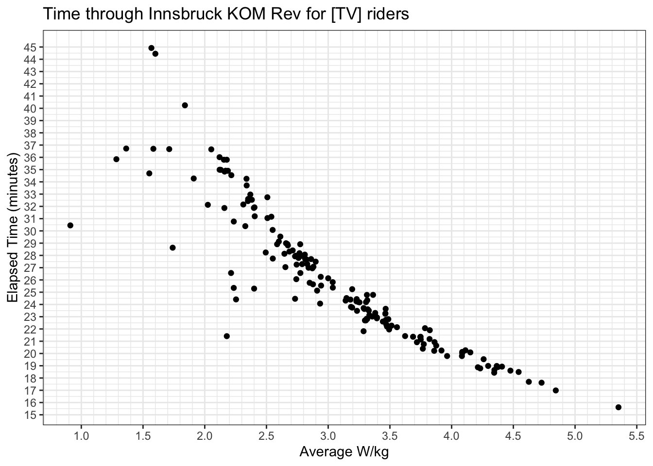
Looks a lot like an inverse power law relationship, so we can model this by taking natural logarithms of both sides and running a linear model on it (or we can just use nls, but this is more straightforward):
data_for_plot <- segment_data_tv %>%
  select(zwid, power, weight, elapsed) %>%
  mutate(
    wkg = power/weight,
    ln_wkg = log(wkg),
    ln_t   = log(as.numeric(elapsed))
    )

data_for_analysis <- data_for_plot %>%
  # Assume everyone less <2.0 is not trying, and everyone >5.0 is superhuman
  filter(wkg >= 2.0 & wkg <= 5.0)

lm_spec <- linear_reg() %>%
  set_mode("regression") %>%
  set_engine("lm")

lm_fit <- lm_spec %>%
  fit(ln_t ~ ln_wkg, data = data_for_analysis)
lm_fit %>% pluck("fit") %>% summary()
##
## Call:
## stats::lm(formula = ln_t ~ ln_wkg, data = data)
##
## Residuals:
##      Min       1Q   Median       3Q      Max
## -0.42905 -0.02027  0.00589  0.03331  0.10772
##
## Coefficients:
##             Estimate Std. Error t value Pr(>|t|)
## (Intercept)   8.2087     0.0273  300.70   <2e-16 ***
## ln_wkg       -0.7979     0.0240  -33.25   <2e-16 ***
## ---
## Signif. codes:  0 '***' 0.001 '**' 0.01 '*' 0.05 '.' 0.1 ' ' 1
##
## Residual standard error: 0.06324 on 149 degrees of freedom
## Multiple R-squared:  0.8812,	Adjusted R-squared:  0.8804
## F-statistic:  1106 on 1 and 149 DF,  p-value: < 2.2e-16
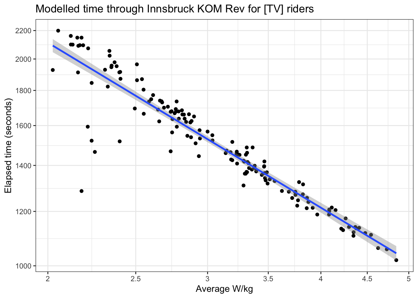
So this fairly nicely fits a power law model, as we can demonstrate:
Next, we’ll pull a list of everyone in our pen from the DRS website, and pull their best efforts on the same segment from ZwiftPower:
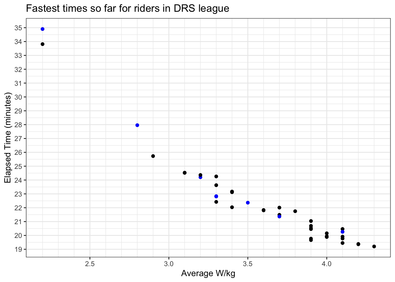
This follows a similar pattern (blue spots our team, black everybody else) - but can we be sure that’s a maximum effort?
Well, lets get really nerdy to answer this.
We can also pull power curves from ZwiftPower, which reflects the maximum power a rider can lay down for a given length of time. Lets do that now, for everyone in the pen:
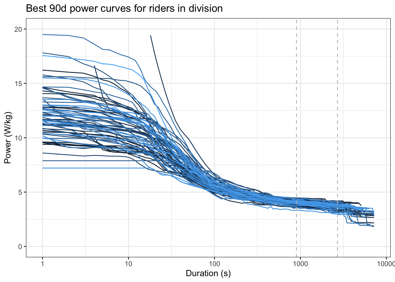
Note that there’s a fair range of abilities at the left (short effort, i.e. sprints) but the spread is a bit closer in the 15 to 45 minute range that this climb is going to take (dashed lines).
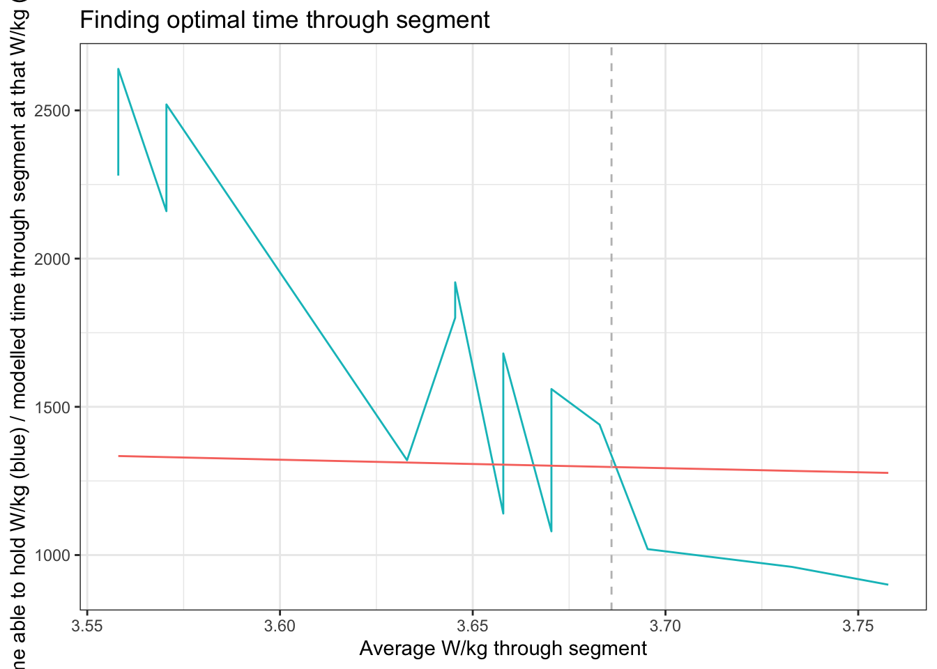
Ok, so if we know a rider’s power for a given length of time, we can use the model we derived above to work out how long it would take them to complete the segment at each of those powers. Plotting the two against each other finds the optimal time and power for the segment, i.e. the lowest possible time for a power they can sustain for at least that time. For example, here’s my plot of that - blue shows the power I can sustain (x) for a given time (y), and red the time it would take me to complete the segment at that power. The crossover for what’s achievable for me occurs at around 3.69 W/kg.
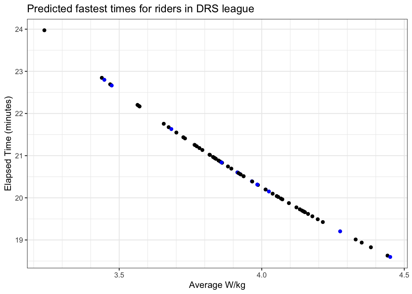
So we can now repeat that for everyone, and build a table of power that everyone should be able to hold and the time it’ll take them to complete the segment at that power. Nifty for race planning (and it looks a bit like this):
So how did it go?
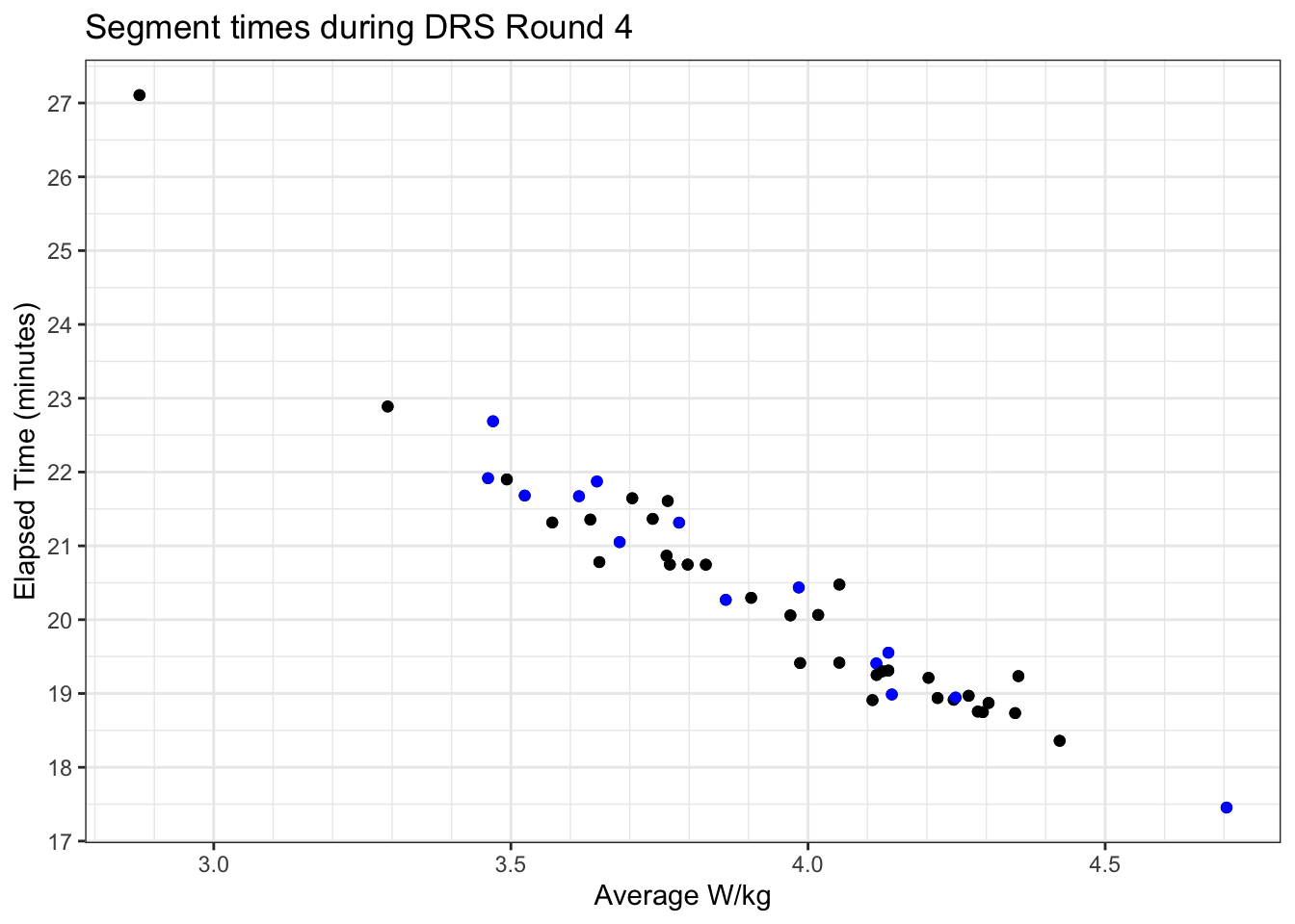
Well now the race is over and I’ve recovered my breathing, we can pull the results form ZwiftRacing, which gives us a list of who from the potential pen entered the race, and match this to KOM efforts on Zwiftpower matching this event ID. It looks like this:
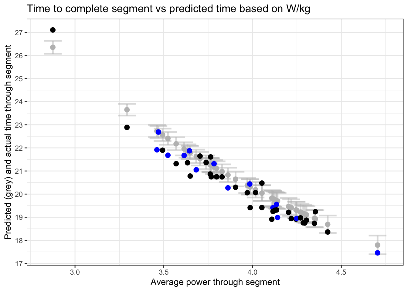
There’s two ways to assess the model performance - whether the W/kg and time relationship held, and how people did versus what we thought they’d do.
The first of these is simple - plot actual results vs the range of results that the model predicted for the W/kg they laid down on the day, and the model relationship seemed to hold fairly well:
To answer the second, we can look at the difference between what we predicted would happen before the race and what actually happened. As you can see below, there’s a fair few people who went harder than anticipated from their 90 day power profile, and were correspondingly faster (by up to 2 seconds, but every point counts). There were also a few who put down less effort than anticipated, but on the whole we were within a 0.25W/kg and less than 2s either way for the field.
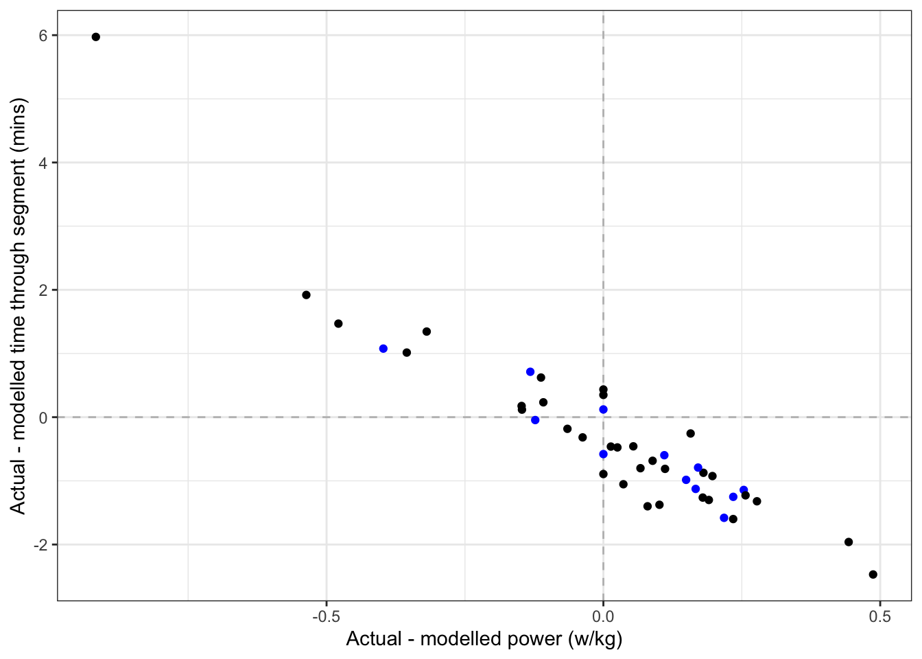
The blue spots almost all being in the bottom right side of the plot suggets that having this information available helped, too! I call this a success for the team (and a new PB up that hill for me).
Nick Plummer
Trainee anaesthestist intensivist, amateur data scientist, slow triathlete
Recovered geophysicist. Cares intensively, sciences data, and occasionally gives an anaesthetic.